Analysis & Recommendations
Please find below the process used to analyze the dataset. All graphs have been created on R
Data Cleaning & Preprocessing
The data received was a combination of both English and Marathi hence the first step was translation to English for easier insights. This was done using the GOOGLETRANSLATE() function.
Followed by this the xlsx data was pulled in R where some basic cleaning functions were performed such as converting BLANKS/NA's to 0, removing duplicates at all levels, splitting comma separated column data into multiple columns to cover all values, different data manipulation techniques to improve readability etc
Packages Used:- openxlsx, readxl, dplyr, rmarkdown, stringr, splitstackshape, tidyr, data.table, writexl etc
Exploratory Data Analysis
Now that the data has been cleaned and is now in a readable format, the next step was to derive insights. Please find insights below based on which potential rally ideas have been suggested.
Packages Used:- ggplot2, plotly, validate, scales and other packages mentioned above
Background
There are three types of ration cards in India namely white, yellow and orange:-
- Yellow Ration Cards: Yellow colour ration cards are issued only to families who fall under the Below Poverty Line (BPL) category.
- Orange Ration Cards: Families with a yearly income of more than Rs. 15,000 and less than 1 lakh can apply for the saffron/orange smart ration card.
- White Ration Cards: Families with an annual income of Rs. 1 Lakh or above can apply for white smart ration cards.
Analysis done
As shown below The first step was trying to understand the overall dstribution of household by ther their ration colour.
Findings: Here we found that most of the household have yellow or orange ration cards
The next step was trying to understand if all of the households within these 2 categories receive ration since they fall in the low income category
Findings: While most do receive their ration which is positive we would like to understand which states/districts donot receive their ration
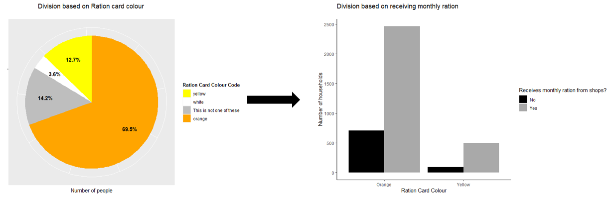
We see from the charts below that Maharashtra is the state with the highest number of households and within this Pune is the city where the problem is prevalant
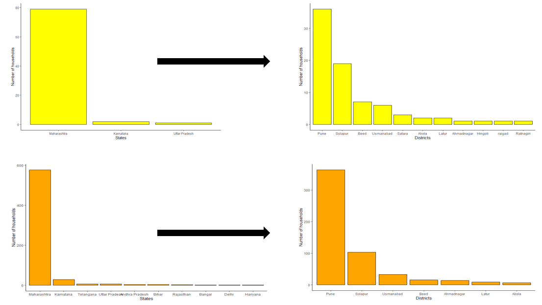
Thus the first focus of the NGO can be coordinating with the villages in Pune to ensure rationing to all their residents
Analysis done
We used a boxplot to determine the state spending maximum amount on healthcare
Findings: Maharashtra has a large number of outliers that spend more than 2,500 rupees per month on healthcare
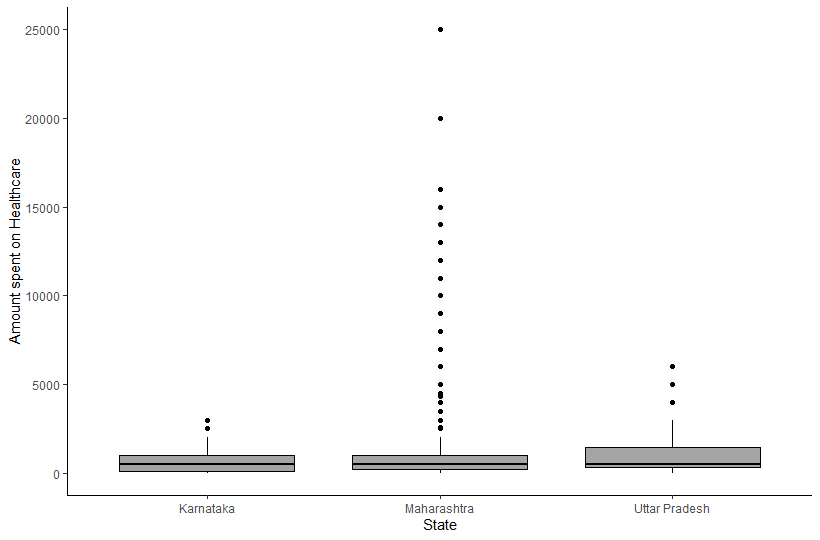
We further drilled down and filtered for households spending greater than or equall to 2,500 rupees in Maharashtra
Findings: Here we noticed that while Pune had a few outliers that spend a lot on healthcare, on an overall level Aurangabad has a higher average spent
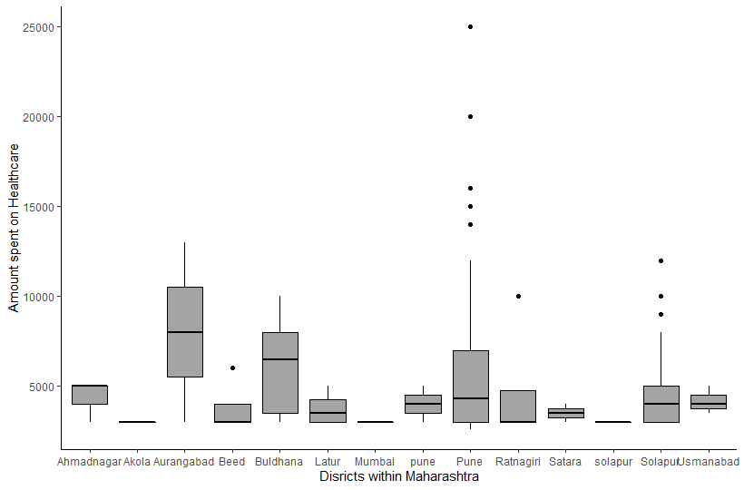
Thus the NGO can focus on these villages in Aurangabad who spend a large amount on healthcare and in turn should offer some subsidies for the same
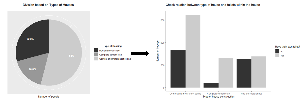
Analysis
We first try to identify the types of houses
Findings: The most durable kind of house involves a complete cement slab. However the least percentage of houses seem to fall in this category
The next step was trying to understand if most of the houses with no washrooms fall under the mud and metal sheet houses which is the weakest kind of house
Findings: As expected those with houses made out of mud or metal sheets have almost a 50-50 distribution between those with their own toilets and those who do not. Comparing this ratio also lets us know that in case of houses completely made of cement which is the strongest also tend to have their own washrooms.
Thus we can focus on those who do not have washrooms in the metal sheet and mud and metal category
We see from the charts below that maharashtra is the state with the highest number of households without a toilet and within this Pune is the city where the problem is prevalant
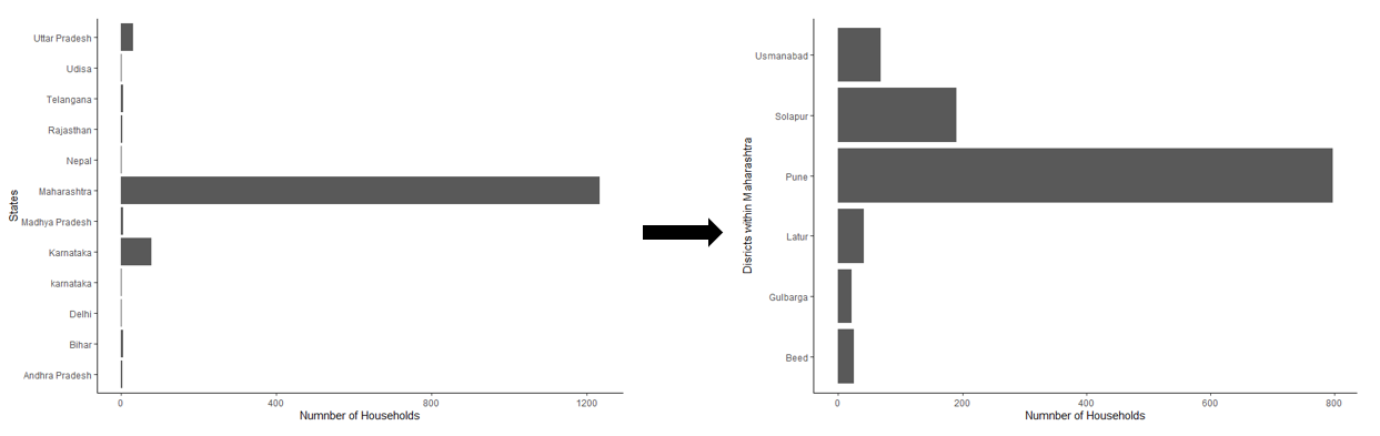
Thus the first focus of the NGO can be coordinating with the villages in Pune to ensure construction of proper washrooms thus ensuring better hygiene
Dashboard Creation
Once done with basic exploratory data analysis, the next step was creating a dashboard on Tableau to summarize different factors such as housing, rent, income etc
The drop down above the map of india enables us to filter on both state and district to find all metrics in a particular location. Click here to view the dashboard